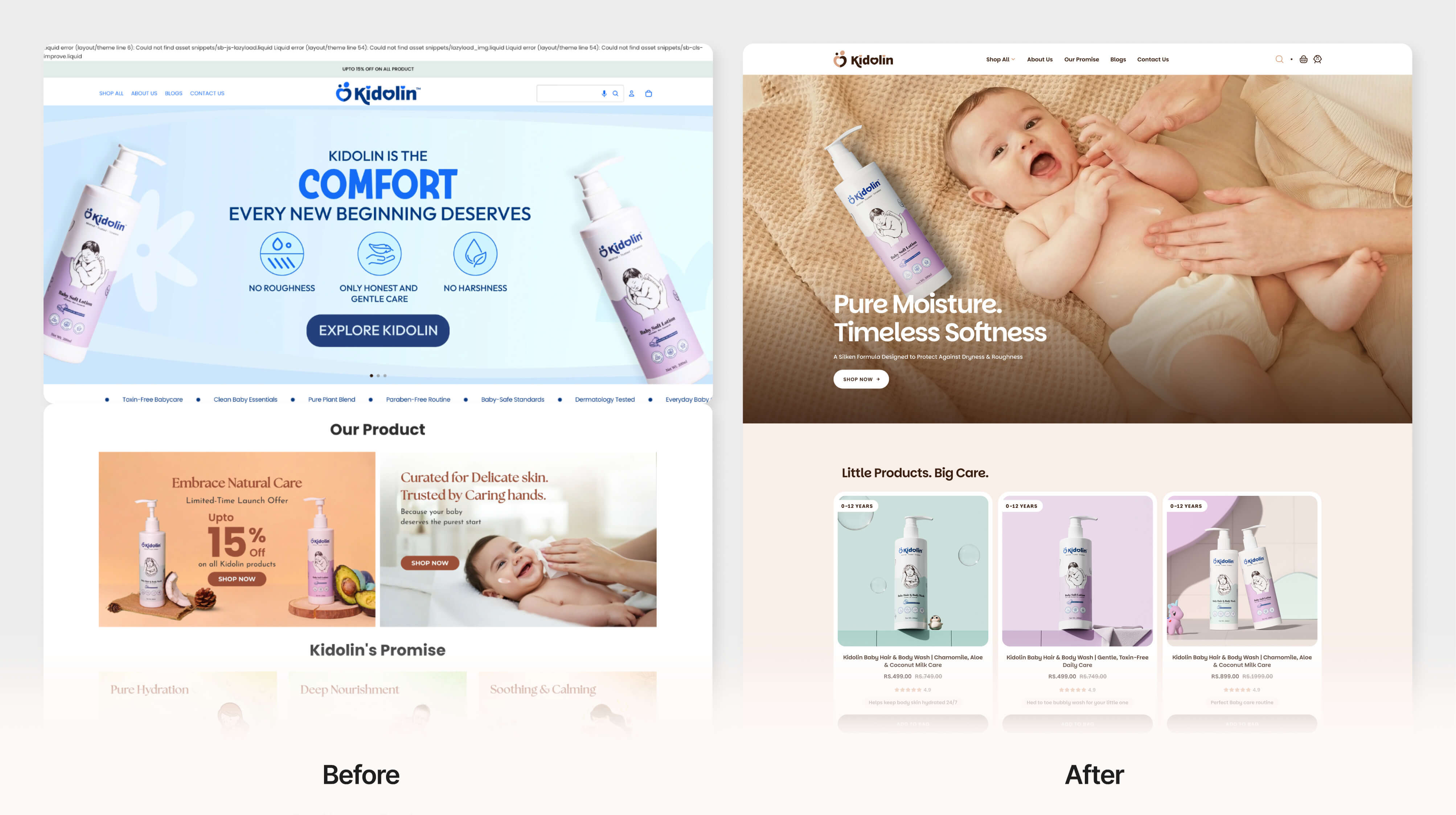
Baby care products are not purchased the same way as regular consumer products. Parents don't just buy a product; they buy trust. When Kidolin approached us, the challenge wasn't limited to packaging. The brand needed a complete transformation that could better connect with modern parents while creating a stronger presence across digital and physical touchpoints. This project involved brand refinement, packaging design, product visualization, and the development of a cohesive visual language that feels gentle, trustworthy, and emotionally engaging.
Introduction
Baby care products are not purchased the same way as regular consumer products.
Parents don’t just buy a product; they buy trust.
When Kidolin approached us, the challenge wasn’t limited to packaging. The brand needed a complete transformation that could better connect with modern parents while creating a stronger presence across digital and physical touchpoints.
This project involved brand refinement, packaging design, product visualization, and the development of a cohesive visual language that feels gentle, trustworthy, and emotionally engaging.
Understanding the Problem
The existing brand lacked the emotional qualities parents expect from a baby care product.
The visual identity relied on vibrant colors, inconsistent typography, and packaging that struggled to communicate safety, softness, and trust.
As we studied the category, one thing became clear:
Parents are naturally drawn toward products that feel calm, transparent, and reassuring.
The packaging needed to communicate those emotions before a customer even picked up the bottle.
Design Objective
Our goal was to create a packaging system that:
Feels gentle and trustworthy
Appeals to modern parents
Improves visual clarity
Creates stronger shelf presence
Establishes consistency across products
Works effectively in both physical and digital environments
Rather than following common baby-care clichés, we focused on creating a modern and emotionally driven experience.
Building the Visual Language
The new design direction was inspired by the relationship between parents and children.
We introduced a softer color palette featuring warm neutral tones that immediately create a sense of comfort and safety.
Typography was simplified and restructured to improve readability while maintaining a friendly personality.
Every visual decision was made to reduce noise and increase emotional connection.
The Illustration System
At the center of the packaging is a custom illustration featuring a parent bear holding its cub.
This became the emotional anchor of the design. The illustration symbolizes:
Protection
Care
Comfort
Trust
Parental bonding
Instead of relying on decorative graphics, we used storytelling to communicate the brand’s values visually.
The result is a character system that feels memorable, approachable, and perfectly aligned with the needs of a baby care brand.
Information Hierarchy
One of the key challenges was balancing emotional appeal with functional communication.
Parents often make decisions based on ingredients, safety claims, and product benefits.
To support this behavior, the packaging was structured with a clear information hierarchy.
Important details such as:
Product name
Age suitability
Key ingredients
Benefits
Safety information
were carefully organized to improve scanning and readability.
This approach helps build confidence while making the product easier to understand.
Packaging Design
The final packaging combines simplicity, warmth, and functionality.
Soft peach tones, generous white space, rounded forms, and clean typography work together to create a premium yet approachable appearance.
The design feels gentle enough for baby care while remaining distinctive on the shelf.
Every element was designed to strengthen trust and improve recognition.
Extending the Experience Through 3D Visualization
Packaging was only one part of the experience.
To bring the product to life across eCommerce and marketing channels, we created a complete set of 3D product visualizations.
The goal was to maintain the same emotional tone established through the packaging.
Soft lighting, playful supporting elements, floating bubbles, and warm environments helped create visuals that feel calm, clean, and child-friendly.
These renders provided the brand with a consistent visual system that could be used across product listings, social media, advertising, and website experiences.
Creating a Consistent Brand Experience
One of the most important aspects of this project was ensuring consistency between the physical product and digital presentation.
The packaging, illustrations, colors, typography, and 3D visuals were all designed as part of a single system.
This helped create a unified brand experience regardless of where customers interacted with Kidolin.
The Outcome
The final result is a baby care packaging system designed around trust, comfort, and parental connection.
By combining thoughtful packaging design, storytelling-driven illustration, and high-quality 3D visualization, Kidolin now communicates the values that matter most to parents.
The project demonstrates how strategic design can transform packaging from a container into a meaningful brand experience.